Moving a brand from property to lifestyle
Brand Development, Web Design, Market Research, Brand Strategy

Our work with Bargate Homes began at Ashwood, a new development in a woodland village. Bargate wanted to promote a lifestyle – not just their homes. So, we developed a concept and a style that transformed a property brochure into a piece of lifestyle branding: one that brought Bargate’s brand values into the spotlight. The overwhelming success of our approach made Rooster a long-standing partner – and we’ve since become Bargate’s exclusive supplier for marketing communications.
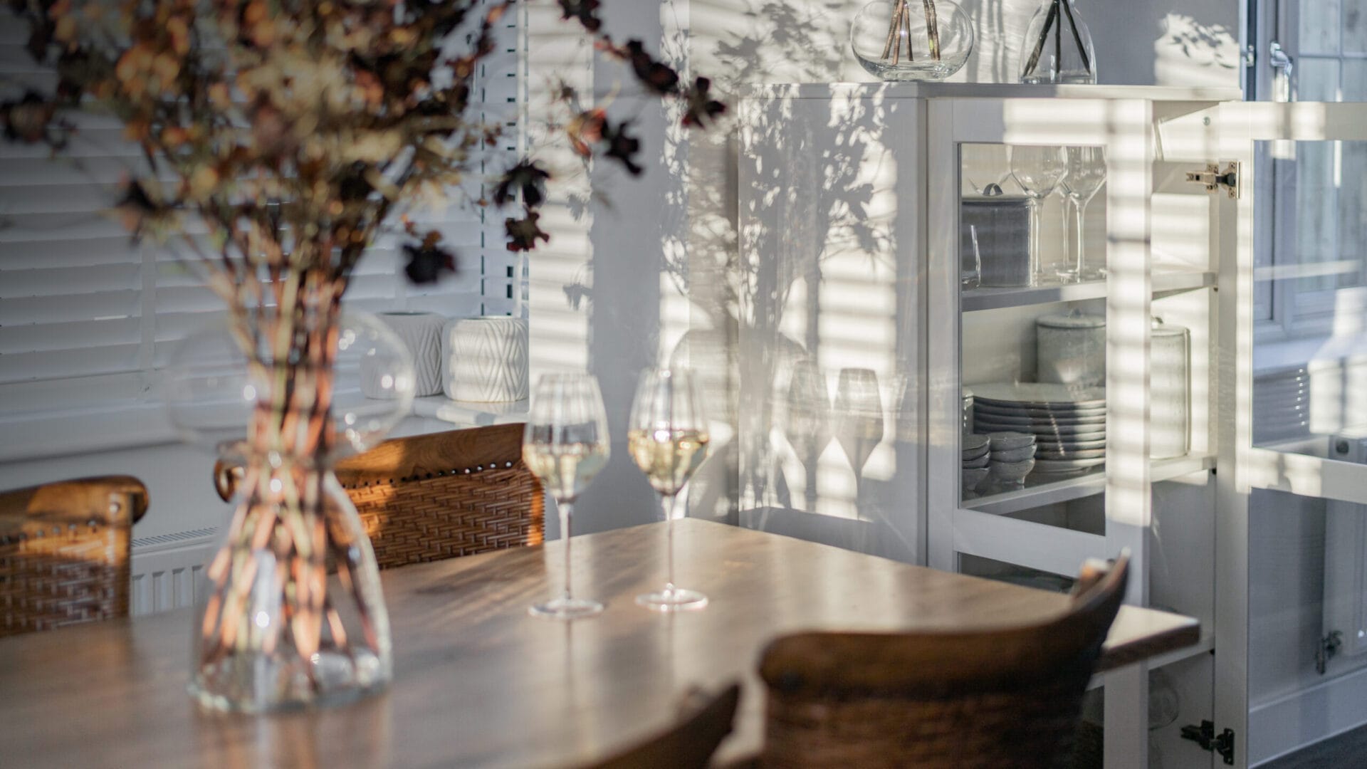
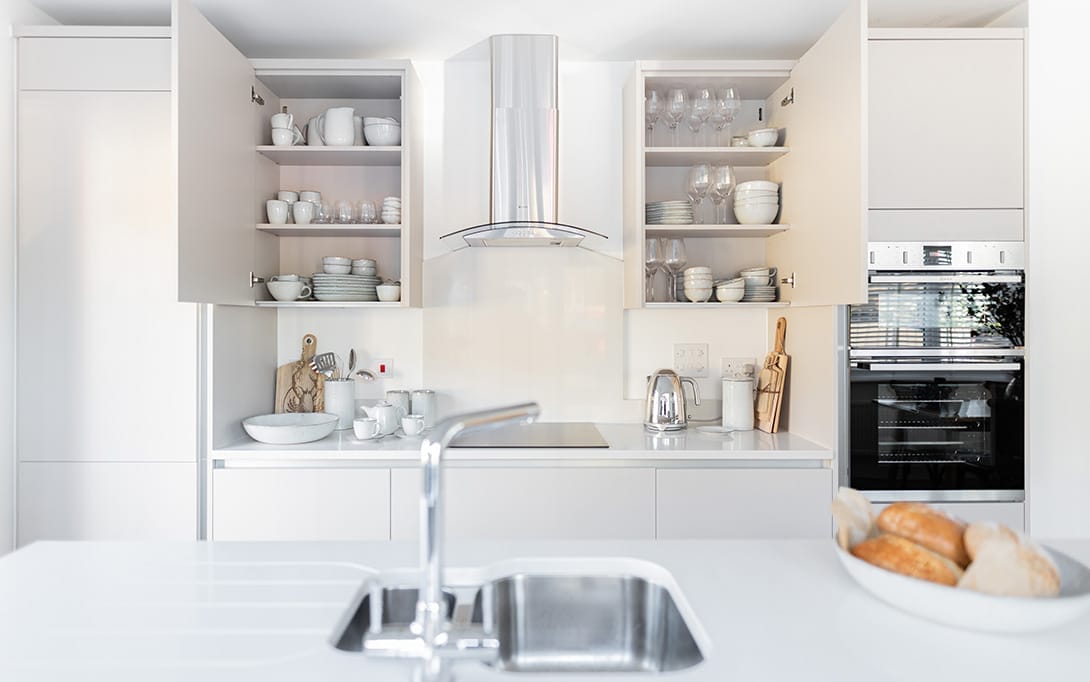
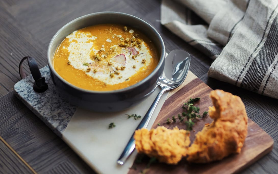
Rooster has produced an impressive library of photography for use across marketing platforms – including brochures, social media and email campaigns. We captured compelling visuals in the bokeh style, to showcase the homes built by Bargate, their developments and the surrounding villages they build in.
Through imagery, design and layout, Rooster has helped to realise the ‘Bargate Lifestyle’.
For each shoot, we thoughtfully selected props and captured models in natural poses, enjoying their environment. Our Art Director managed every shot, paying close attention to detail – using colour and depth of field to draw the viewer in. Every image was carefully edited in our studio at The Mill, to make them print and digital-ready.


Bargate’s website combines their carefully crafted lifestyle look and feel with a crystal-clear user interface. It’s clean and bright, with the same stunning photography used across brochures and campaigns. We developed advanced search functionality, with postcode integration and filters. A custom-designed map, running on the Google Maps API, allows users to find their ideal location with pinpoint accuracy – and each home can be categorised in a number of ways, to pair the right user with the right property. Bargate’s online brand experience is seamless across platforms, because of our careful attention to detail and mobile responsive design.
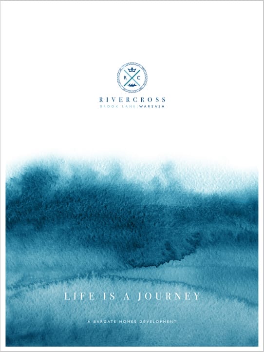
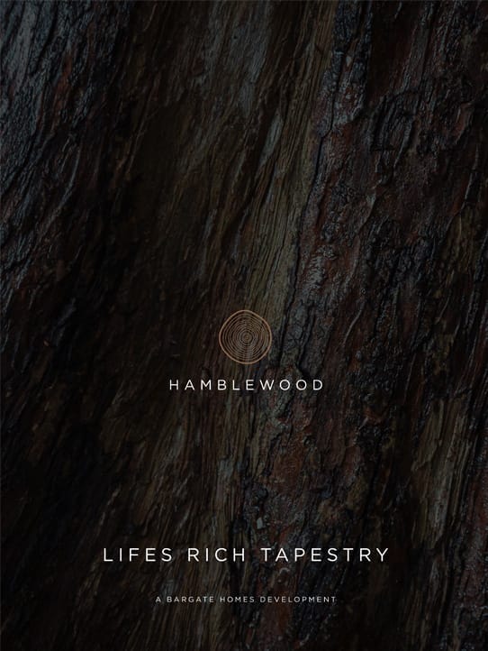
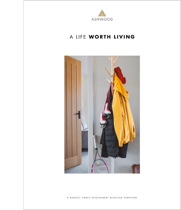
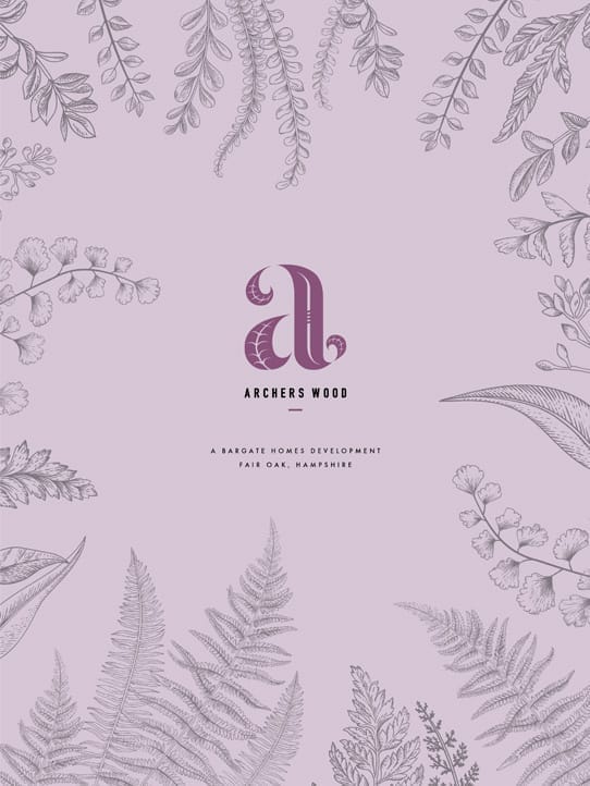
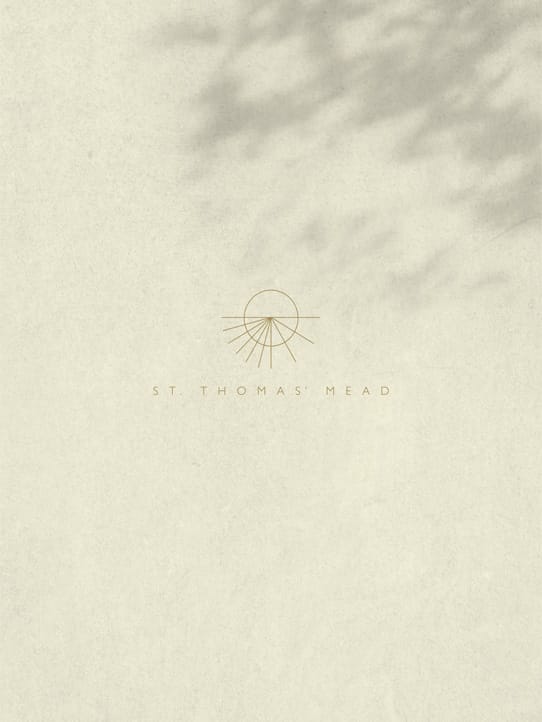
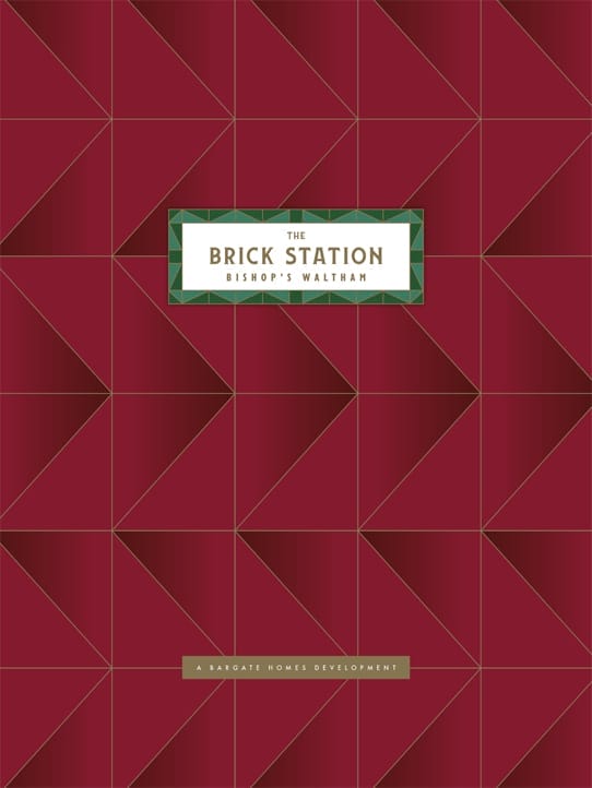
Rooster continues to design a series of luxurious brochures, inspired by each development’s unique character. We work closely with Bargate on every brochure we create, to establish a creative direction that refers to their brand values – but brings the development and surrounding area to life.
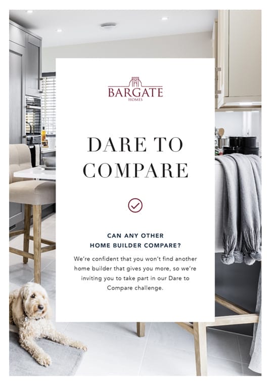
We reinforce Bargate’s pivot into lifestyle branding with considered copywriting, unique to every development. We use storytelling, conversational and relaxed language, metaphor and imagery. We turn phrases and show character, while retaining the sophistication that embodies the brand.
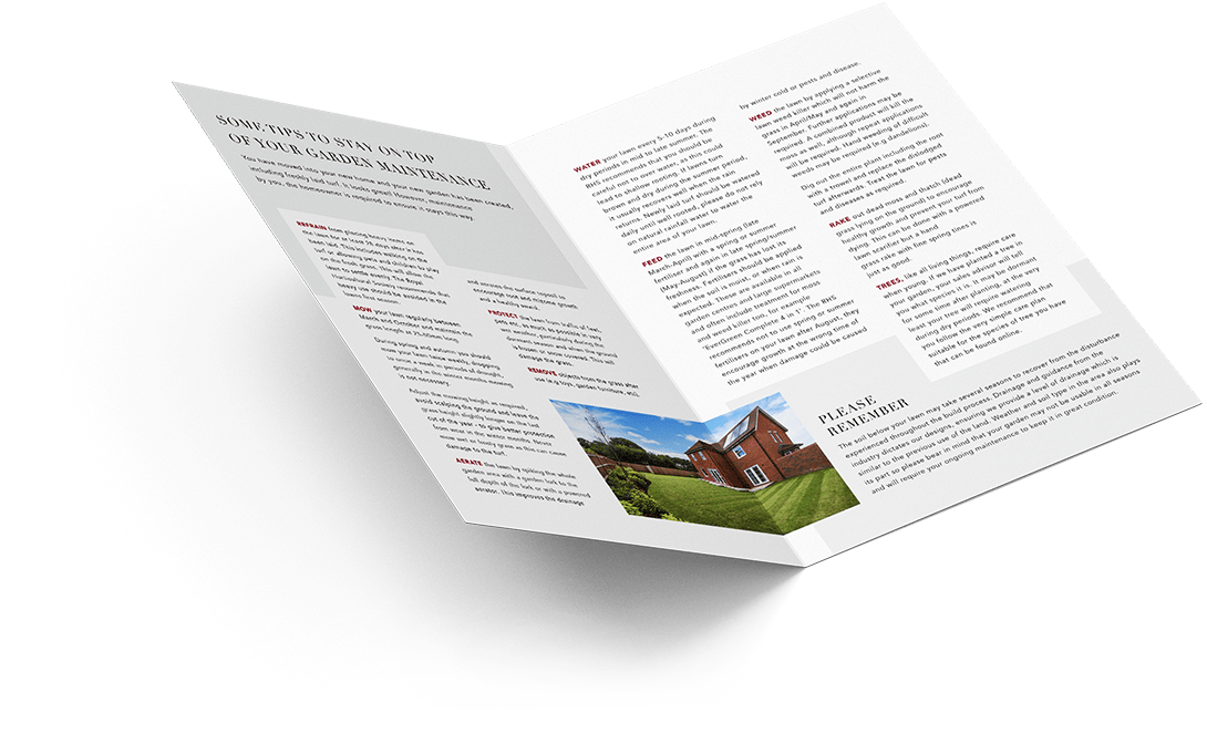
Our printing partners have helped us to deliver astonishing finished products to the client. Beautiful, tactile brochures that cement the quality look and feel that Bargate once aspired to, and are now in full ownership of.
We keep the story flowing in Bargate’s print collateral, which tightly tracks their core brand. In a crowded marketplace, these printed materials showcase the novel ways in which Bargate markets themselves, and give potential customers the information they need to make buying a home easier.
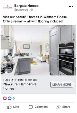
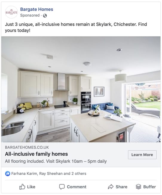
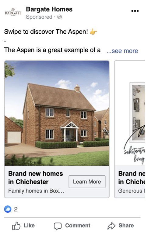
Social media advertising has been a staple of Bargate’s marketing mix since we began working together. They made a bold decision early on to abandon traditional advertising streams on property websites, and took full control of their own digital advertising. Our social ads have performed exceptionally well, by combining targeted audiences with photography, design and compelling copy.
Google Ads are another part of our integrated marketing strategy – and Rooster developed unique, location-based campaigns to deliver the right traffic to their website. We’ve helped Bargate retain their leads while significantly reducing the cost from advertising on third-party websites – with complete control over their advertising.
We’ve taken some huge creative leaps with Bargate’s marketing. Seasonal campaigns for Valentine’s Day, Halloween and Christmas have won them the adoration of their customers, as well as new fans on social media. Each campaign has focused on copywriting, design and physical pieces, delivered to customers’ doors. We’ve tied these together with video, photography and social media hashtags to build buzz around the brand in their key audience demographics, and the continued success of these campaigns has made Rooster a valued partner to Bargate.