Rebranding a freezer favourite
Branding, Creative, Web Redesign

New Forest Ice Cream is a widely recognised brand, known as one of the leading ice cream manufacturers in the UK. Their existing brand was restricting the company from elevating into the high-end catering and retail sectors, so they approached Rooster to develop a new concept.


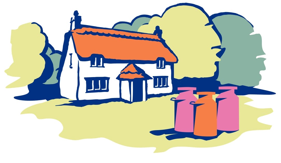
The brief was to retain a feeling of heritage and connection to the existing brand, but to lose the softness of the cottage scene. They wanted a stronger, clearer and more refined brand that fits with modern styles and values.
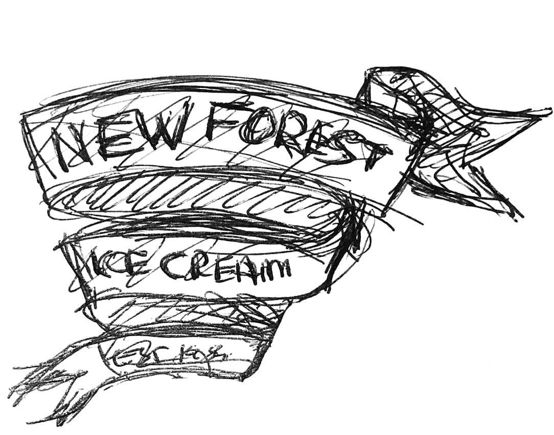
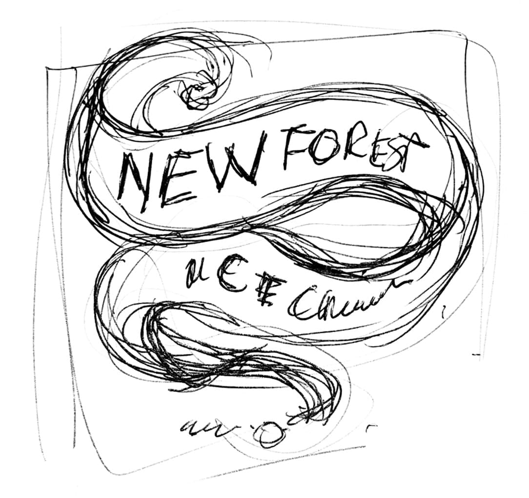
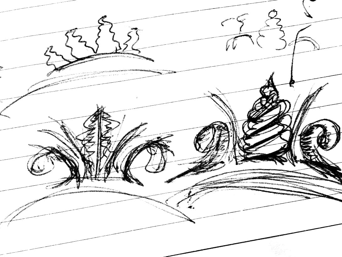
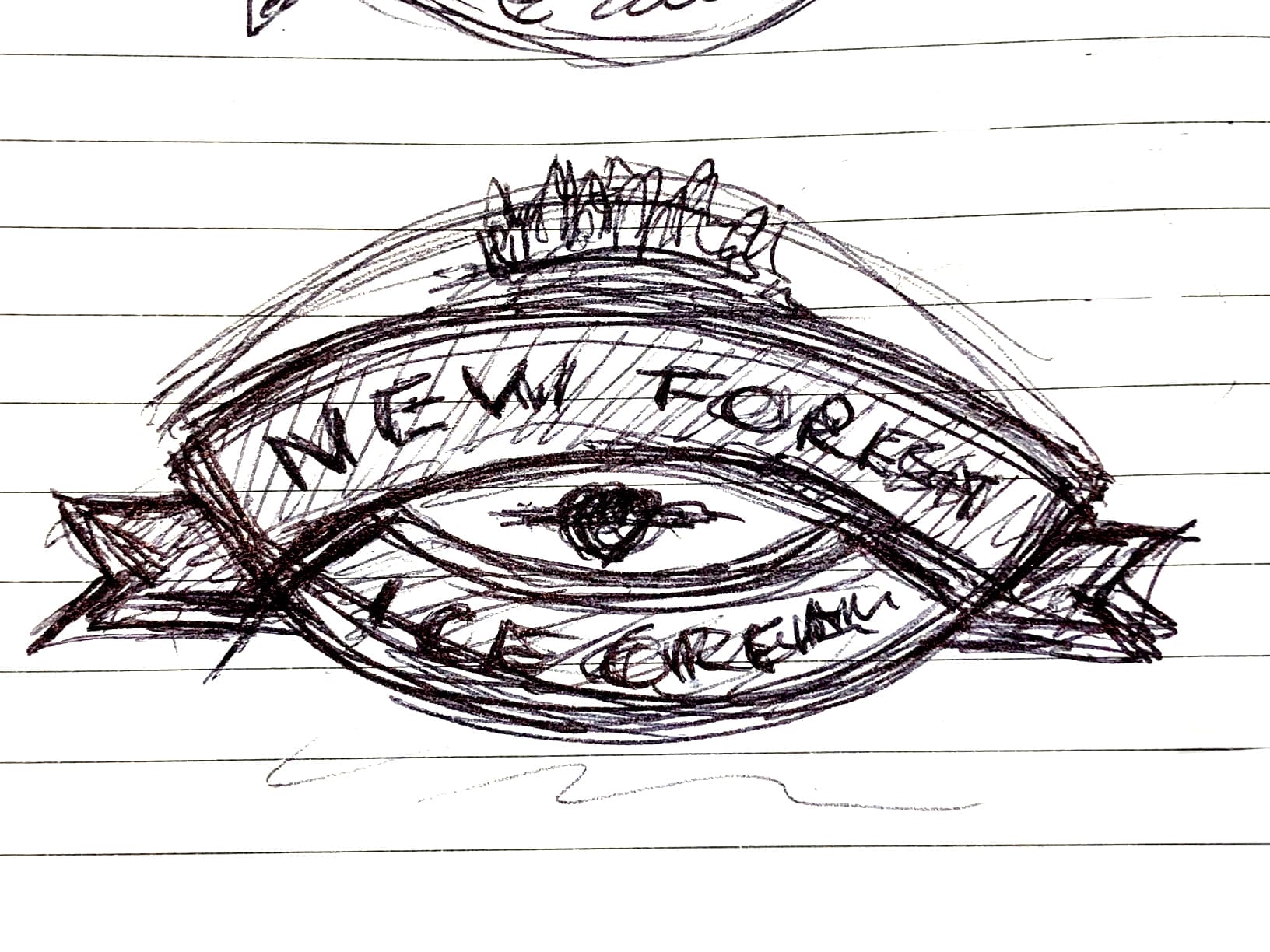
We went through an extensive research phase and presented several considered approaches. We explored an evolution of the existing brand and imagery, as well as more modern options based on flavours and ingredients.
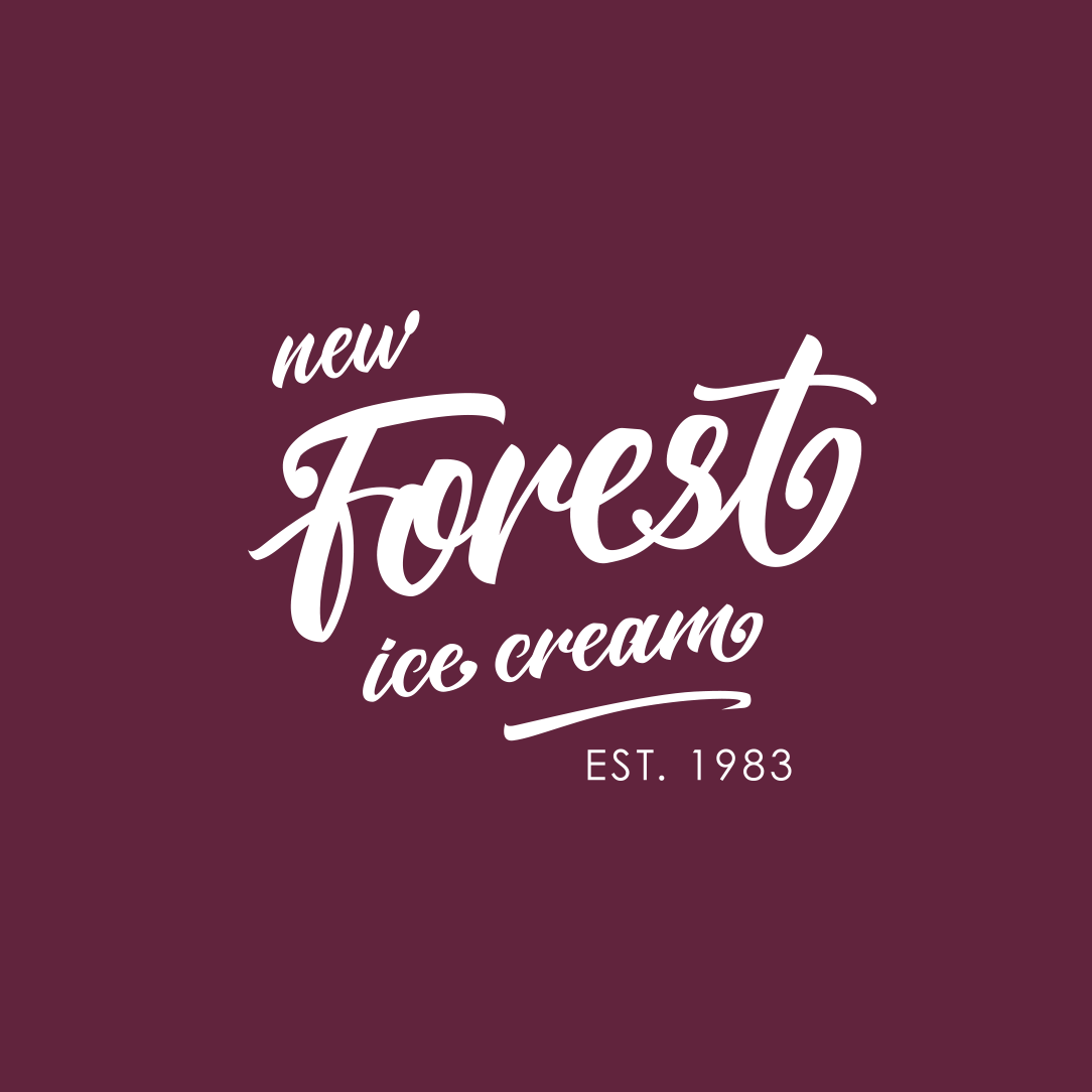

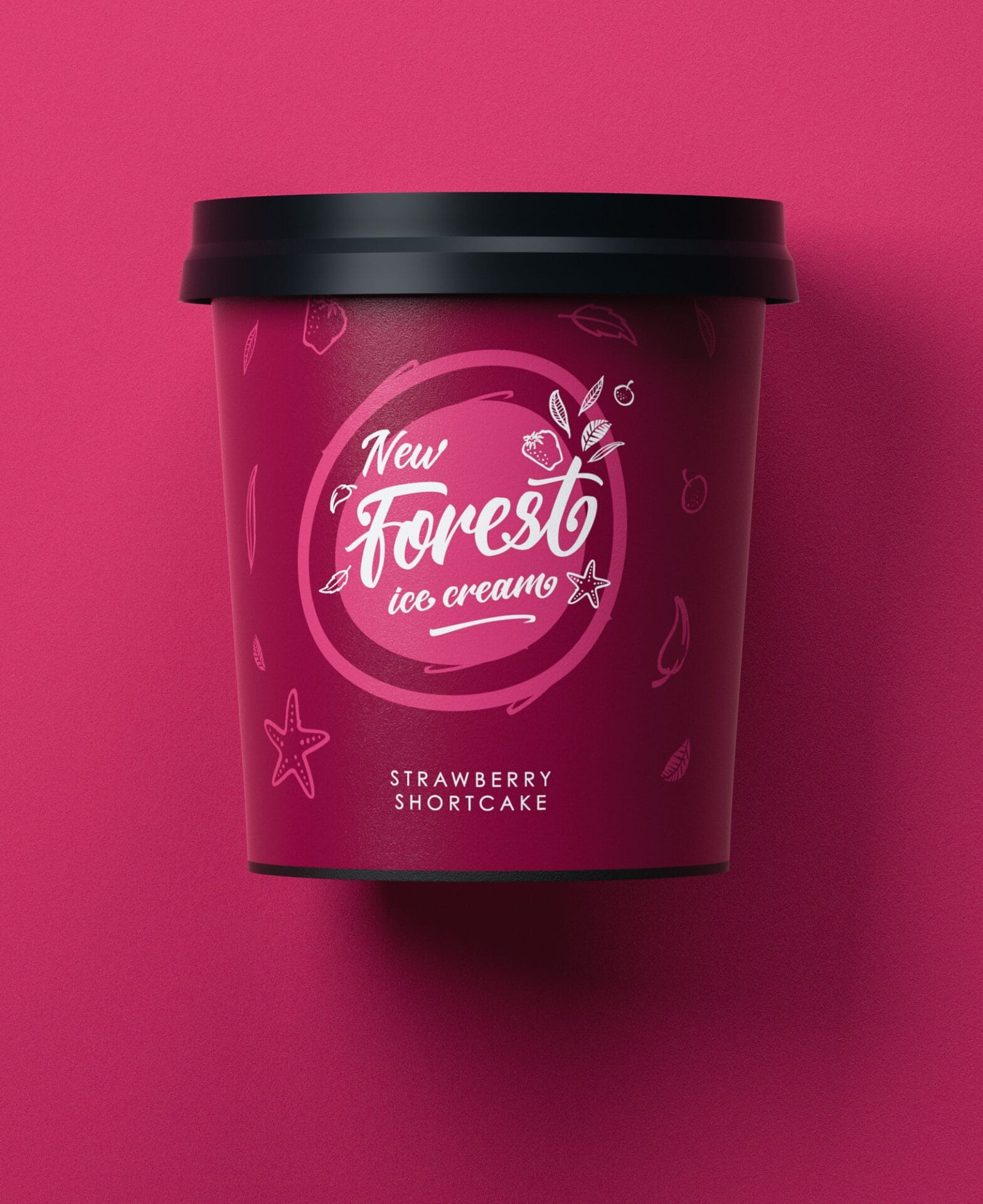
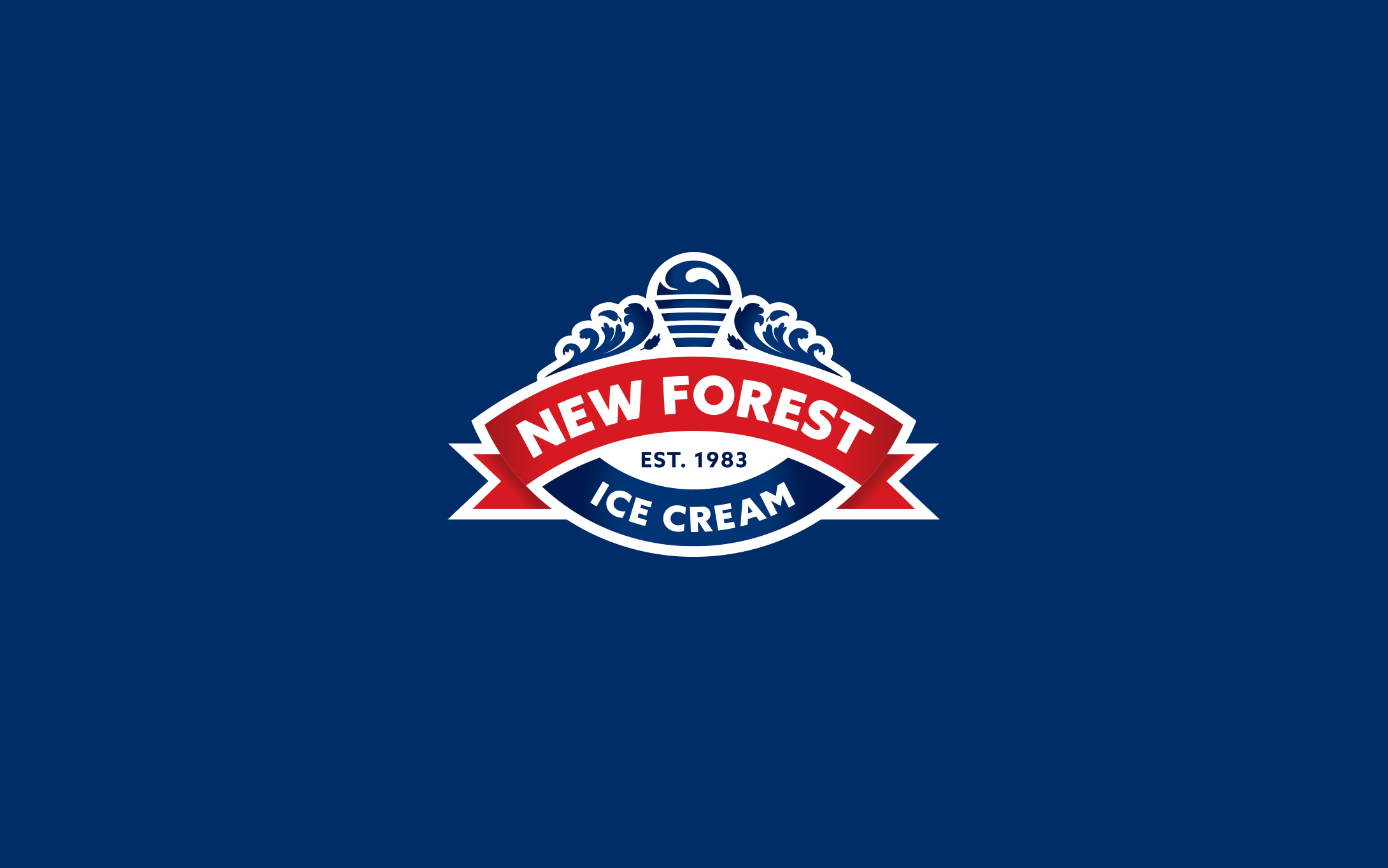
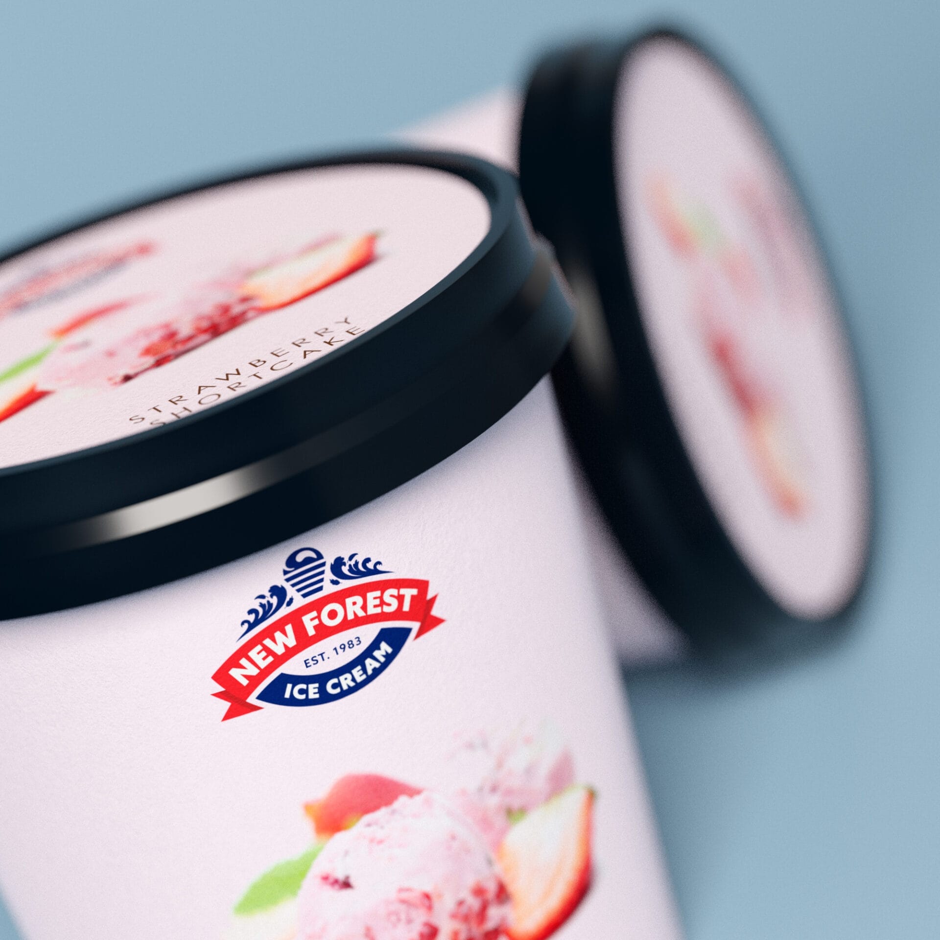
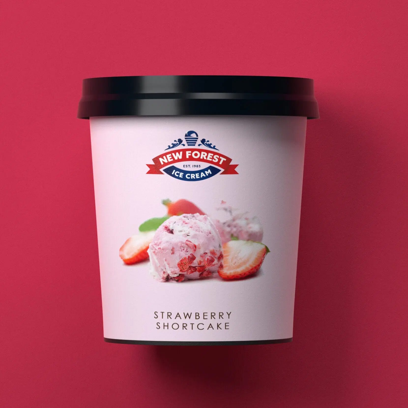
The final design took the most visually dominant elements from the existing brand. The red ribbon was a vital feature, where the brand equity and heritage of New Forest Ice Cream was most visible. We introduced ‘Est. 1983’, as a stamp of historic significance. The ribbon’s rich red colour pushes the white of the New Forest element to the front. A secondary blue ribbon was introduced to carry ‘Ice Cream’, and we introduced the stylised ice cream cone and crest detailing at the top of the logo.
The crest was inspired by the company’s New Forest location, an area of natural beauty on the south coast. The scroll shaped crest hints at waves and a forest in bloom.
The new brand is simple, but it forms a strong identity – flexible for the varied marketplaces and production items the logo needs to be applied to. It still holds onto all the brand values of New Forest Ice Cream, but it brings that heritage into the modern day.


Part of our work with New Forest Ice Cream was redesigning their website, incorporating the new branding. We wanted to capture all the child-like excitement and fun of getting ice cream – in a visual explosion of flavour. We developed a mouthwatering colour palette, and combined it with appealing closeup photography and images.
We followed the cues set by their new brand, with a clear navigational route and flat design, to make the whole web experience enjoyable.
