An uncompromising brand for an uncompromising company
Brand Development, Web Design, Market Research, Brand Strategy


Hollis Rouse London is a specialist construction company that delivers uncompromising projects and exceptional customer experiences. Every project is bespoke, crafted by uniquely skilled artisans. We created a brand identity that communicates the company’s values and position in the market. The brandmark and visual identity we designed strives for the same bespoke, artisanal quality.
In principal combing, the initials ‘HR’ create a simple, elegant identity. The way the letters join and flow together shows the time and care taken over the brandmark. The same timeless style that Hollis Rouse London gives to their work is applied through every aspect of the brand; from the reinvention of a classic typeface to the balance of flow through the lettering. We specified the identity to be printed onto a range of green stock, unique to Hollis Rouse – applied in a fine metallic copper foil.


The Hollis Rouse London web experience starts with a luxurious fullscreen display of images, to showcase their beautiful projects.
The projects page gives a clear way of viewing examples by category. Each category image has a large luxurious border, which gives space to explain the category on mouse hover.
The simple, natural flow of the navigation works well for customers on the first or second visit – but we also considered users who are starting to think more seriously about becoming customers. A tiered fullscreen menu is used to allow users to jump straight to an inner page of detail.
The animations used, like mouse hover, are like everything else in the Hollis Rouse brand; subtle and tasteful. We painstakingly crafted every detail of the Hollis Rouse website, from font to colour palette, to connect the user experience to the exceptional customer experience that the company provides.
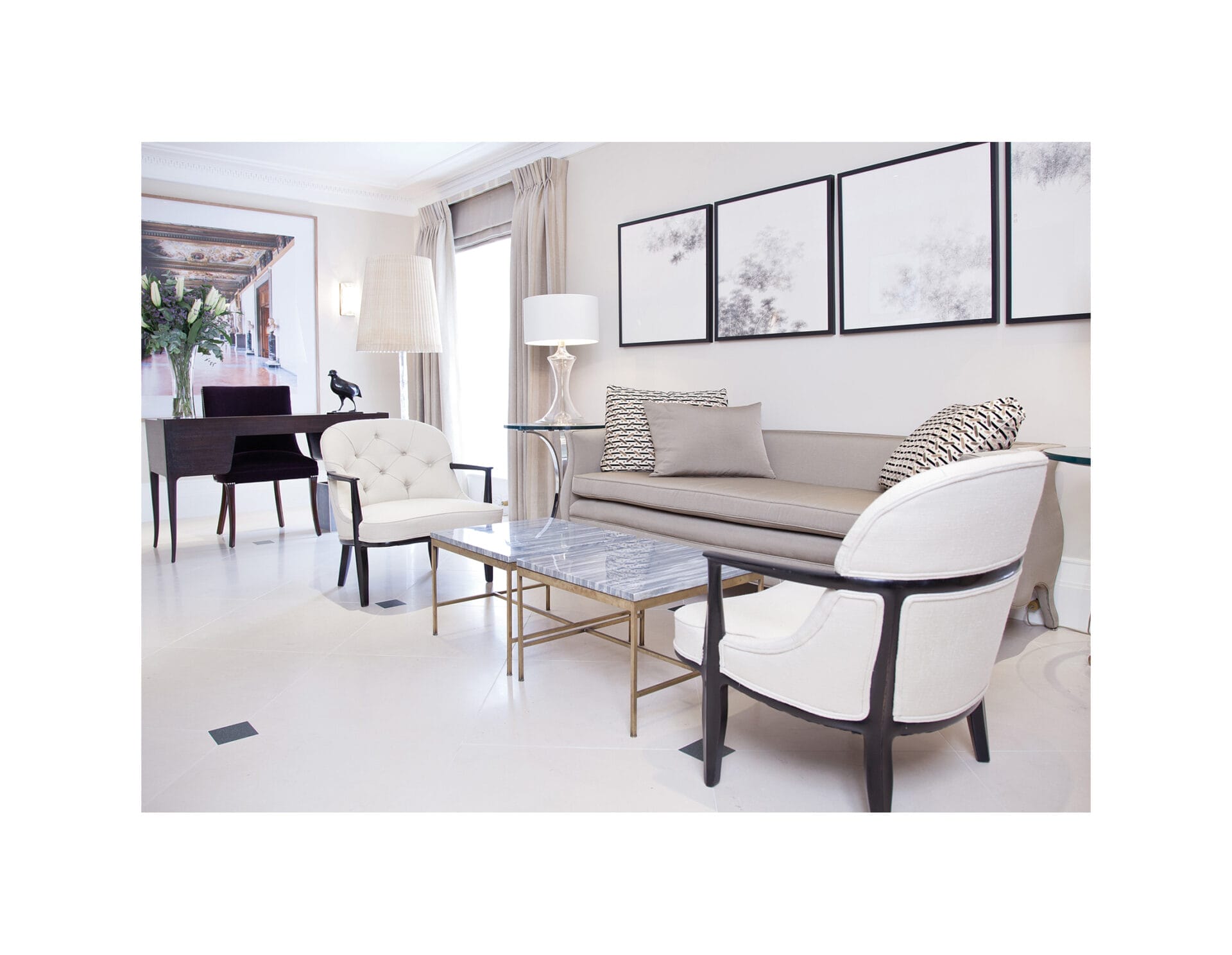
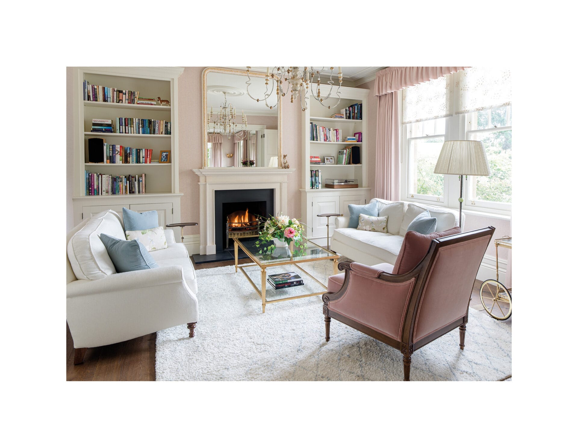
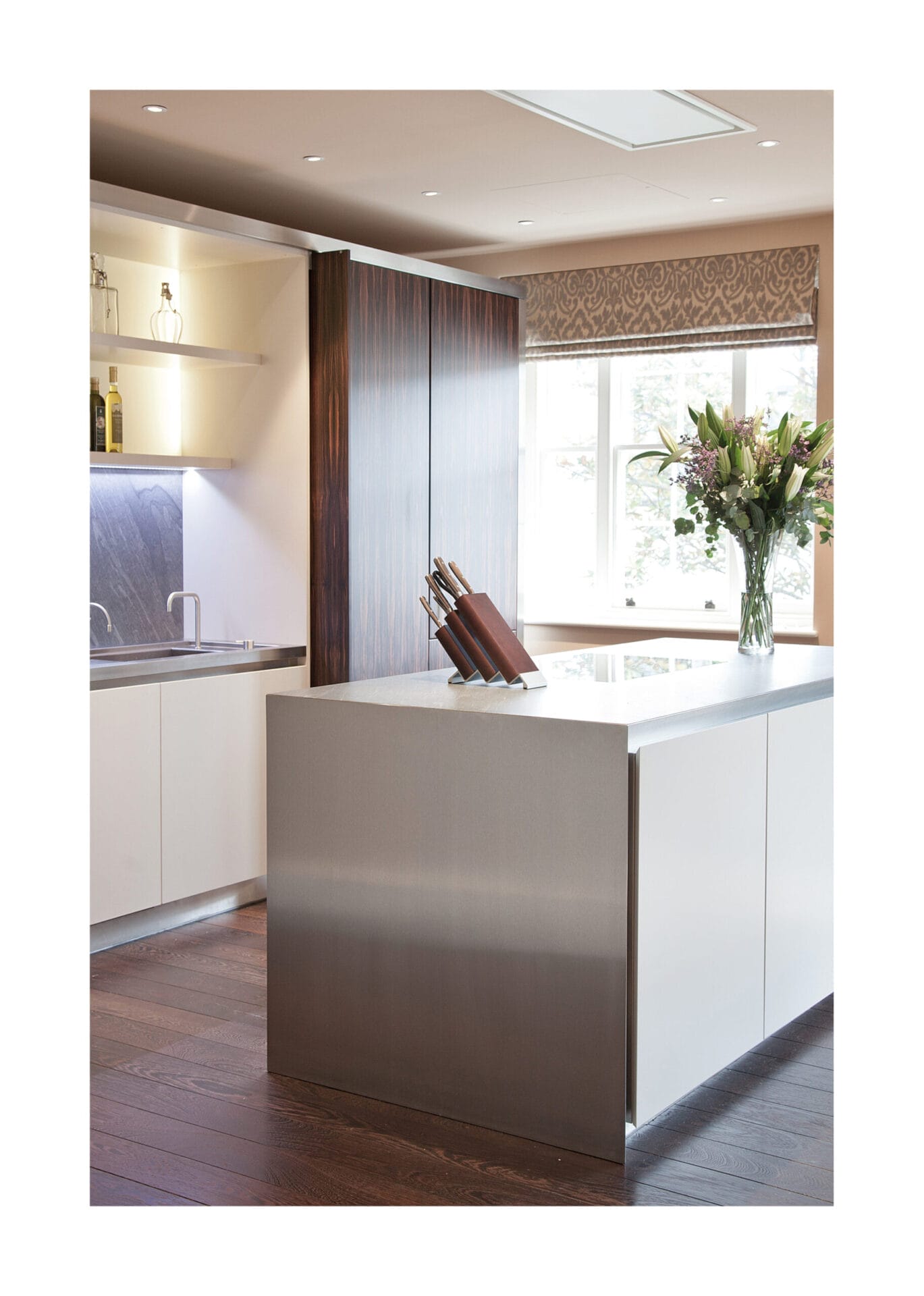
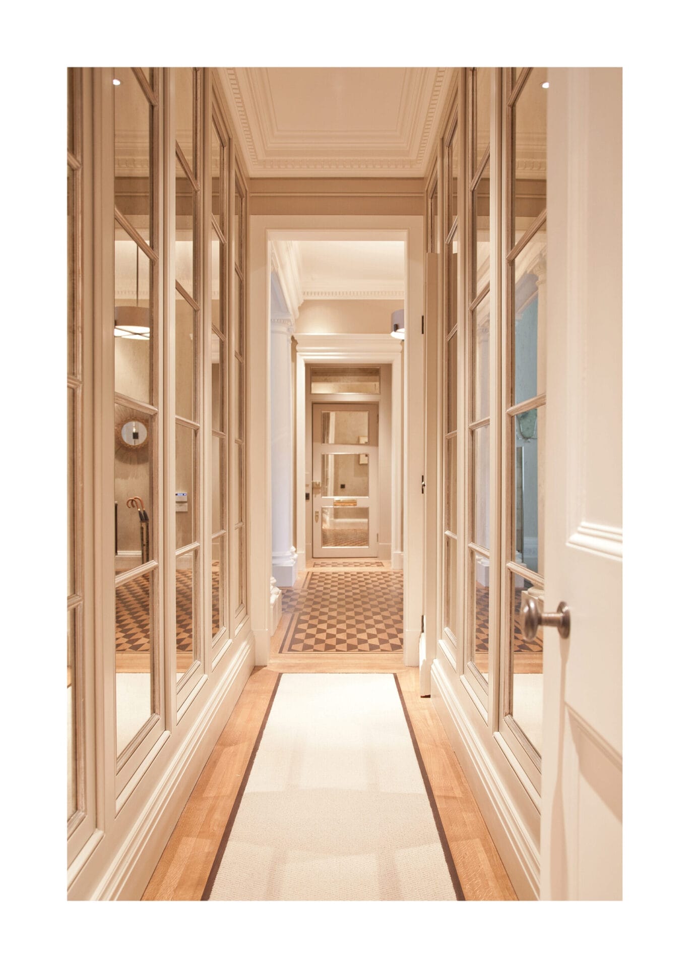
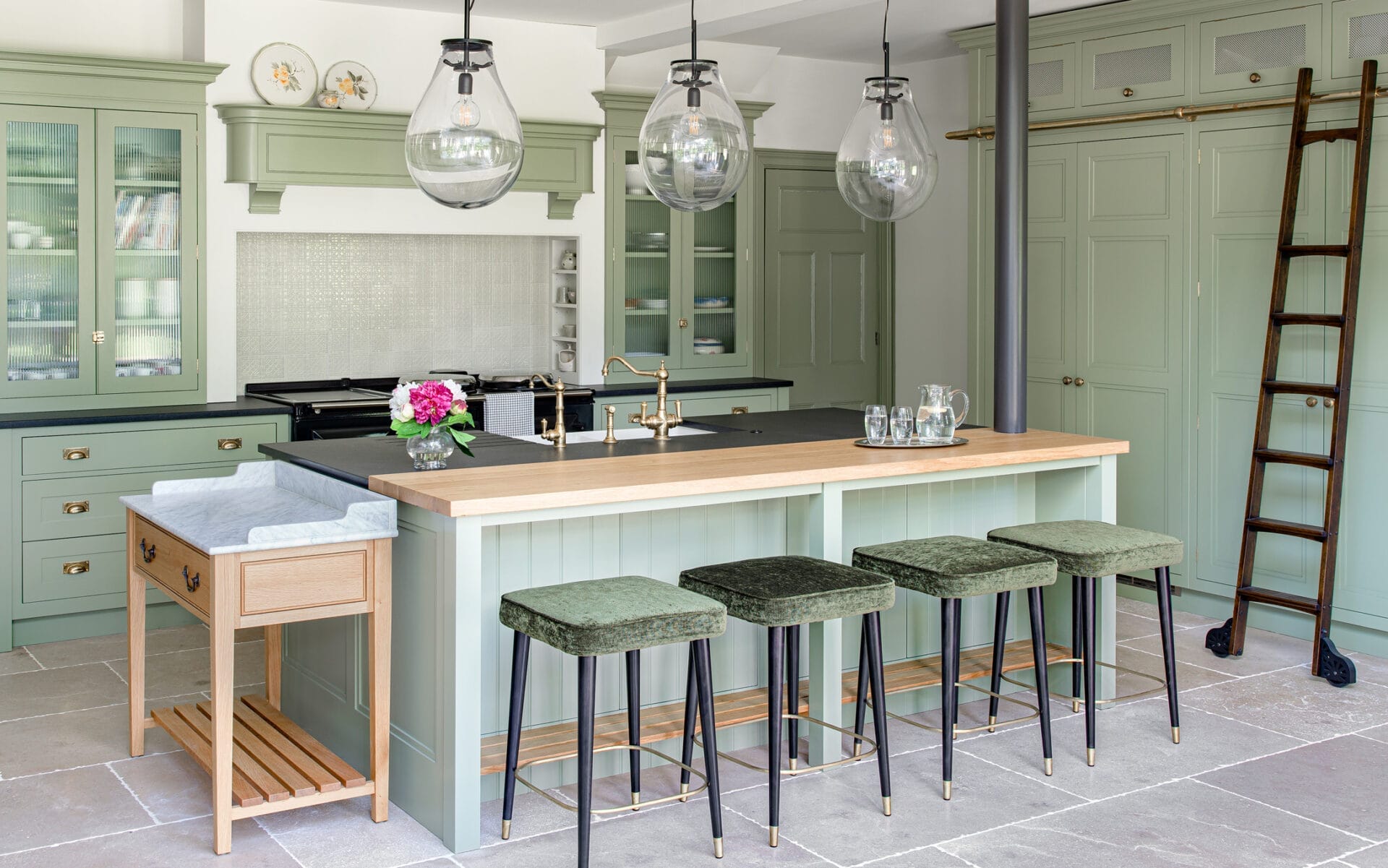
Photography forms an important part of the Hollis Rouse London branding. The selected images had to reflect the quality and craftsmanship of a Hollis Rouse project, so we selected the most impressive elements from some of the finest projects the team has undertaken. We specified imagery that gives a stylised, confident look and feel – with clear and natural lighting.
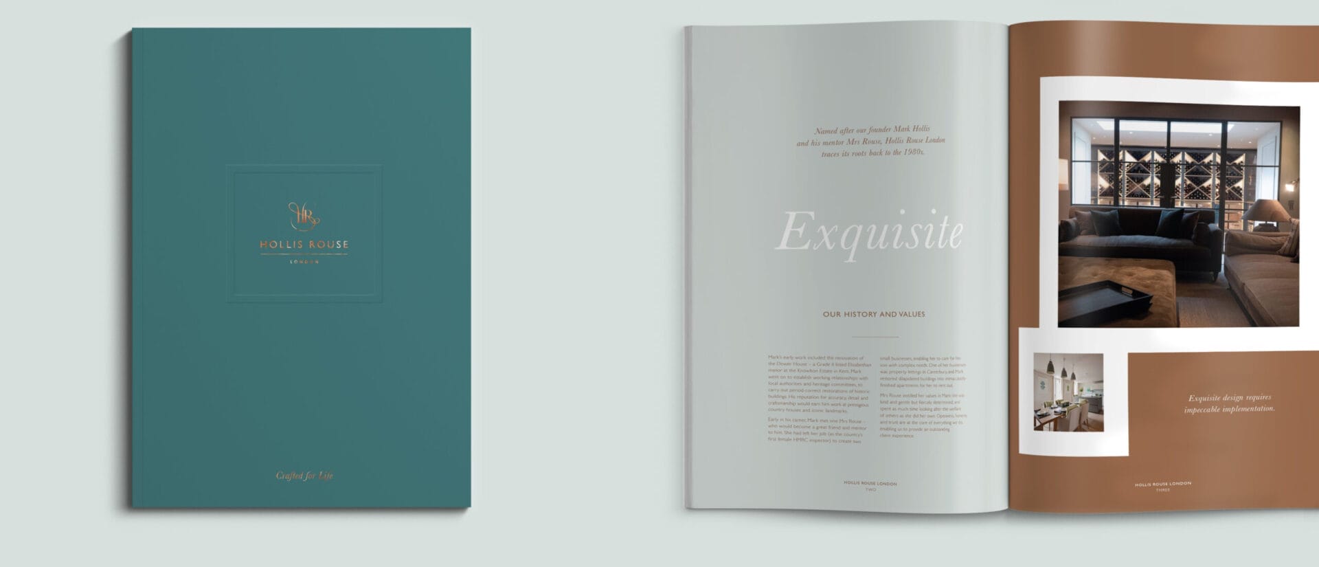
The brochure was designed to position the brand at an elite level; for uncompromising projects, where perfection is expected. The cover is minimal, with a flat colour uncoated stock, and a copper foiled logo with an embossed border. We designed every detail – from colour to copy – to exude confidence and quality.
Opening the cover reveals an interleaf of translucent paper printed with the brand emblem, followed by the brand overview statement. We then have a spread that talks about the history and values of the brand, where we start to introduce images. Throughout the brochure, key statements reinforce the messaging and positioning of the brand.
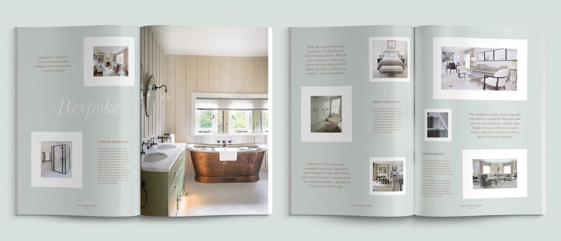
The brochure includes a simplified service rundown and case study pages, where we showcase the quality and bespoke nature of the projects completed. We used hero images that show different textures and finishes, as well as handcrafted furniture and inlay work. Text is minimal, letting the images speak for themselves, simply reinforcing the overall message.
The print finish is a metallic Pantone and copper foil.