Searchlight Cyber
Brand Identity, Website Design, Content Creation


To set Searchlight apart from competitors, we chose to follow relevant trends in the industry and create a website that follows a dark theme to fit with dark UI becoming so popular in recent years.
The biggest selling point for Searchlight is its cases. We streamlined the UX so users can access cases with ease, featuring a special unique layout block on the homepage for optimum efficiency. All resources were then collated in one place so users can access all relevant data with one click per tab, this data was also accessible from top-level pages in a long carousel, differentiated by styling to make sure there was a contrast.
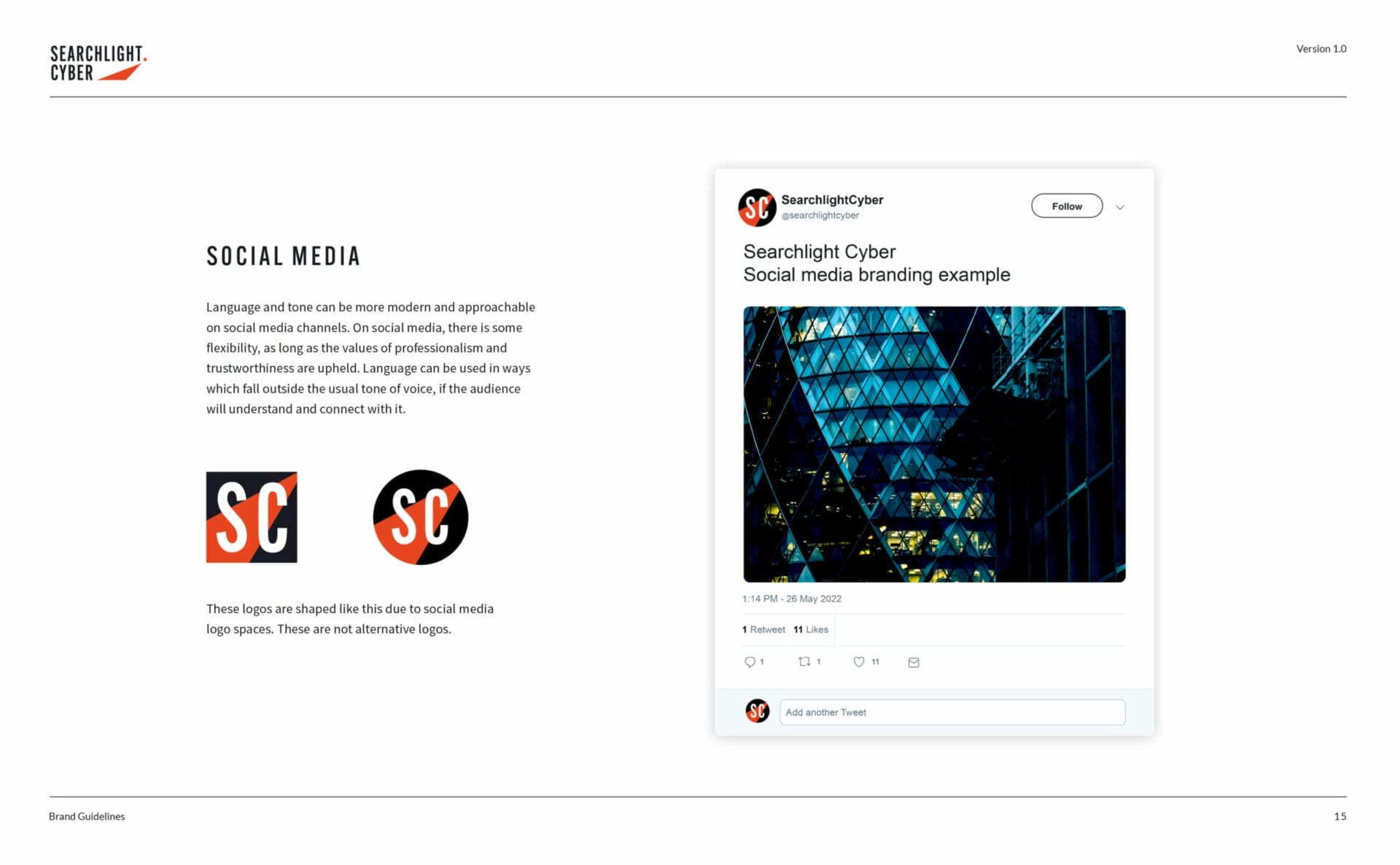

To further enhance the website, the colour orange was utilised to guide the user through the clickable areas of the site and the gradients were introduced to give a nod to a more app-focused design.