 Chris Broadbent
Plane Finder’s logo was extremely symbolic to them; it identified who they were and what they did. We identified that the use of the marque and colours was inconsistent across multiple platforms. The first step in refining the brand was to unify each element, so that users could associate a particular colour palette, font and visual style with Plane Finder.
Through a series of user tests and internal focus groups, we began to form the concept for the new face of the Plane Finder Brand.
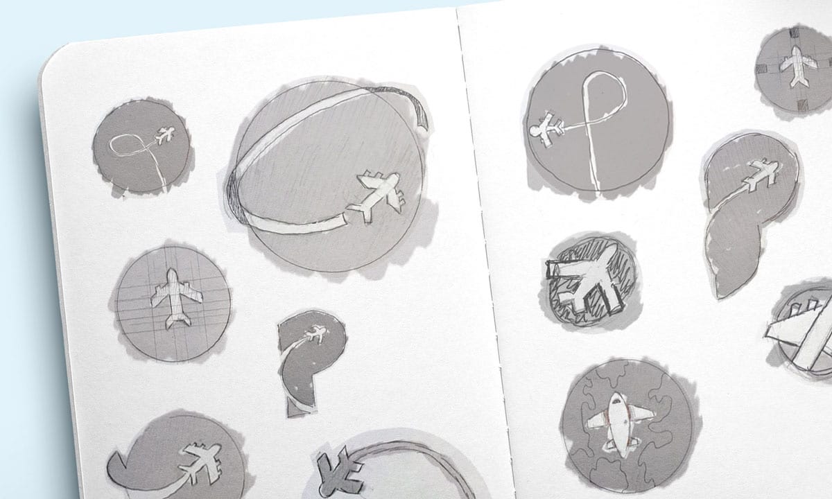
Contrails
By building on the idea of flight tracking and analysing the current offering in the app store marketplace, the contrail was born. As we developed a scamp, it became apparent that when the designs were scaled down the plane trials could look small and busy. So instead, we revised and simplified the concept to show the plane cutting through the shape, leaving a clear path of where the plane has been.


The first thing we needed to do was understand their own desired perceptions; what they wanted people to think and feel about the brand.
We then had to learn how to communicate their desired brand personality; how could they change their current perceptions through tone of voice and presentation?
We then researched their brand positioning at the time, to give an impression of where they could be up against their competitors.
We had to recognise their competitors’ strengths and weaknesses. This would lead into future goals, through in-depth audience research.
From these first stages, we were able to clearly identify where Plane Finder wanted to be, how their current user base saw them and the path that the brand needed to take to reach its goals.
The Icon
When it comes to mobile app design, it’s something that should not be taken lightly: it’s an investment. The UI (user interface) is the first thing your users will interact with on your mobile app and getting it right is fundamental to a successful launch.
It’s not uncommon for app developers to chop and change their designs quite frequently because to them, it’s simply a way for them to stand out from the crowd. But with the right mobile app design, you won’t have to change all the time. The key is to have a design that fits with your long-term business objectives as well your users.
With this in mind, let’s look more into mobile app design.
Mobile App Design, Who, What and Why?
Designing for a mobile app covers everything from how it will look and feel, to how it interacts with the user. It’s just as easy to succeed in one area as it is to fail in another. There’s a very fine line between designing apps for your users and apps for the internal team.
If you’re designing an app that caters for your internal team – stop. The user interface isn’t for your board of directors, it’s for your users. It’s for the people that will be using the app daily, weekly or even hourly.
If you develop a UI that doesn’t cater to needs and requirements, that doesn’t consider previous behaviour, customer insights and market research, you could end up spending a lot of money on an unappealing, unsuccessful app.
The true power of UI is underestimated. And unfortunately, most businesses looking to launch a new app don’t appreciate it. That’s why at Rooster, we approach every project with smarter insights, deeper understanding and creative flair. A great example of our work with UI design is our work with Plane Finder.
Case Study: Plane Finder 3D
Plane Finder is an international flight tracking platform. They first came to Rooster to increase the number of downloads of their iOS and Android app.
The Plane Finder Brand
Rooster began working with Plane Finder back in 2015, where they were initially looking to improve their position within the market for their main Plane Finder app.
We found that their competitors had been working long and hard, trying to push Plane Finder off the map. Our recommendation was to focus on improving their brand presence. Plane Finder was trusted, provided accurate data and most importantly, had a clear purpose.
But there was a lack of consistency across the brand and its various touch points both online and offline. This didn’t match their ethos or where they wanted to be in the market – so we changed it.
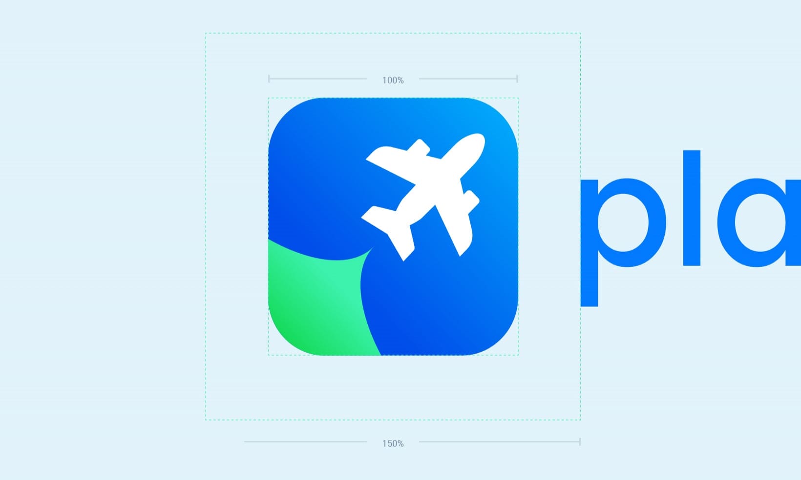
Construction & Scaling
As the icon scales down, the contrail stays clear and prominent. This gives the Plane Finder brand a distinctive graphic on a device homepage and in the iOS Store – one that sets Plane Finder apart from their competitors.
This was particularly important from a UI perspective because, depending on the type of device, the icon would show differently. Plane Finder didn’t want to be too small to recognise on certain devices, so we catered for this with an icon that would fit in a small 24px environment.
Colour Options
For this concept, the icon allowed us to incorporate a vivid colour for their additional applications such as Plane Finder 3D and AR, whilst keeping blue as the primary colour. By implementing different colours, we were able to give Plane Finder a desirable, professional and instantly recognisable icon.
The Result
The logo we created is a powerful symbol of who Plane Finder are as a company; confident, professional and trusted.
To promote consistency across the brand, we made this design with the future objectives of Plane Finder in the forefront of our mind.
Plane Finder’s newly designed branding represents their own desired perceptions; users now see Plane Finder as a modern, cared for and professional brand. We’ve tied this fresh look in with their communication. They’re now bold and proud of who they are. Alongside continuing SEO, this new attitude is being reflected in their content and brand voicing.
We’ve taken the weaknesses of their competitors and used it as a strength for Plane Finder. They now stand out from the crowd in a positive way, with more than a simple plane for an icon.
The New 3D App
From our successful branding exercise came a new UI design, coinciding with the launch of a new Plane Finder 3D app. We were tasked with designing an interface that catered to existing Plane Finder users but also appealed to a new, wider audience.
The Process
With the functionality already developed (key features like airport tracking, search, 3D aircraft view, menus, tutorial and aircraft contrails), we needed a design that represented the brand and provided all users with a memorable and satisfactory experience.
Airports
We looked into the use of the how other apps used airport markers. We found they were often hard to see amongst the sheer volume of air traffic.
Because of this, we created new labels and icons that clearly stood out against the planes and improving legibility, even when viewed at a smaller size. The use of blue text reinforces the relationship between the airport icon and airport name, while the new icon is instantly recognisable as an airport.
Search on Main UI
From looking at tradition icons used for menus and options, we found that they were suited to map filter functions that would give the user the option to turn on and off labels, such as terrain.
We found that if we adopted this to our design and moved the menu icon to the left of the search and used a more recognisable menu icon creating more room for users to move and explore.
Search on Menu
When searching for a plane, it needs to be seamless and legible, we found that often search results of other apps had a lack of consistency.
Our main focus for the search was to create a consistent and coherent search result with identifiable icons for each search category. The new design shows the search result with specific icons for airports, planes and locations. We used these because the user will already be aware of the icons, due to their prominence on the first search screen.
3D View
We approached this icon by looking at the functionality and what the user would naturally expect to happen if they tapped on the icon. The feedback we received included phrases like “location” and “view map of some sort.”
We designed a new 3D view button to fit within the brand guidelines. We did this because when a user clicks this icon, they are taken to a rear perspective view of the plane, flying through the air. We used a purple colour to entice users to click on the icon. Viewing the plane models up close is an impressive feature of the app that needed to be visible and prominent from the initial load.
The Result
A beautiful new UI that caters to the user with specific pushes on key aspects, one that increases the user’s trust in the technology. The new UI conveys professionalism and made the investment in a new app successful.
The original UI worked well in principle, with the information neatly aligned and legible. But the elements were all too small and cluttered together, giving users a less than satisfactory experience. Now, with the new UI, each element has more room, bigger touch sizes and a clearer journey – and most importantly, it all keeps to the new brand guidelines.
Mobile App Design at Rooster
So there you have it, an example of how we offer a truly multichannel service that’s tailored to put your mobile app in front of your customers.
We pushed Plane Finder’s UI from our in-depth exploration and discovery of the wants and needs of their business, while we got to know their user’s requirements to deliver a truly remarkable app that was both visually and functionally pleasing. Our tried and tested process informs our designs: delivering outstanding results.